

So you’re starting your search for a wedding photographer, yay! Except I’m betting you’re going to realize almost immediately that you have a LOT of choices in front of you. Which can be quite overwhelming. The good news is, today’s post will help you narrow down the pool of candidates and allow you to then focus on other important aspects such as who you feel the most comfortable with.
Before you start seriously searching and inquiring with potential photographers, you need to figure out what photography style you like. Otherwise you’re putting yourself in a position where you may not like your end product. I’ve got a lot to say on this topic so I’m going to split this into two parts. Today in Part 1 I want to talk about what I mean by photography style. And then in the next post, I’ll give you some steps to help you start figuring out what style you want for your wedding.
Let’s start by diving in to style and what that entails.
We’re going to start with the obvious statement: Photographers are artists. And as artists, we each have a unique, artistic style that has taken us time and effort to hone in on. Which meansssss…..
- Our style is our style is our style. If you book a photographer whose work is light and airy, you cannot ask them to re-edit your photos in a more moody way. I mean, you can, but it would be like purchasing a Picasso painting and then asking him to repaint it as a pastel landscape because you’re ‘just not liking the whole bold abstract thing’. He’s probably going to say no and tell you to go hire Monet instead.
- There is no right or wrong here! This is art. And hasn’t it been said that beauty is in the eye of the beholder? This 1000% comes down to personal preferences and what resonates with you the most.
Before I continue, let me go ahead and say: this is definitely going to be an oversimplification of photographic styles, as there are so many unique variables that different photographers will bring to the table. But, to me, this is the easiest way to understand what to look for without having to get too involved.
So here we go.
There are essentially two components that work together to make up a photographic style: Posing and Editing. I like to think of both of them as spectrums. And remember, there is no right or wrong when it comes to photographic style. There is no ‘better’ side of either of these spectrums. At. All.
POSING
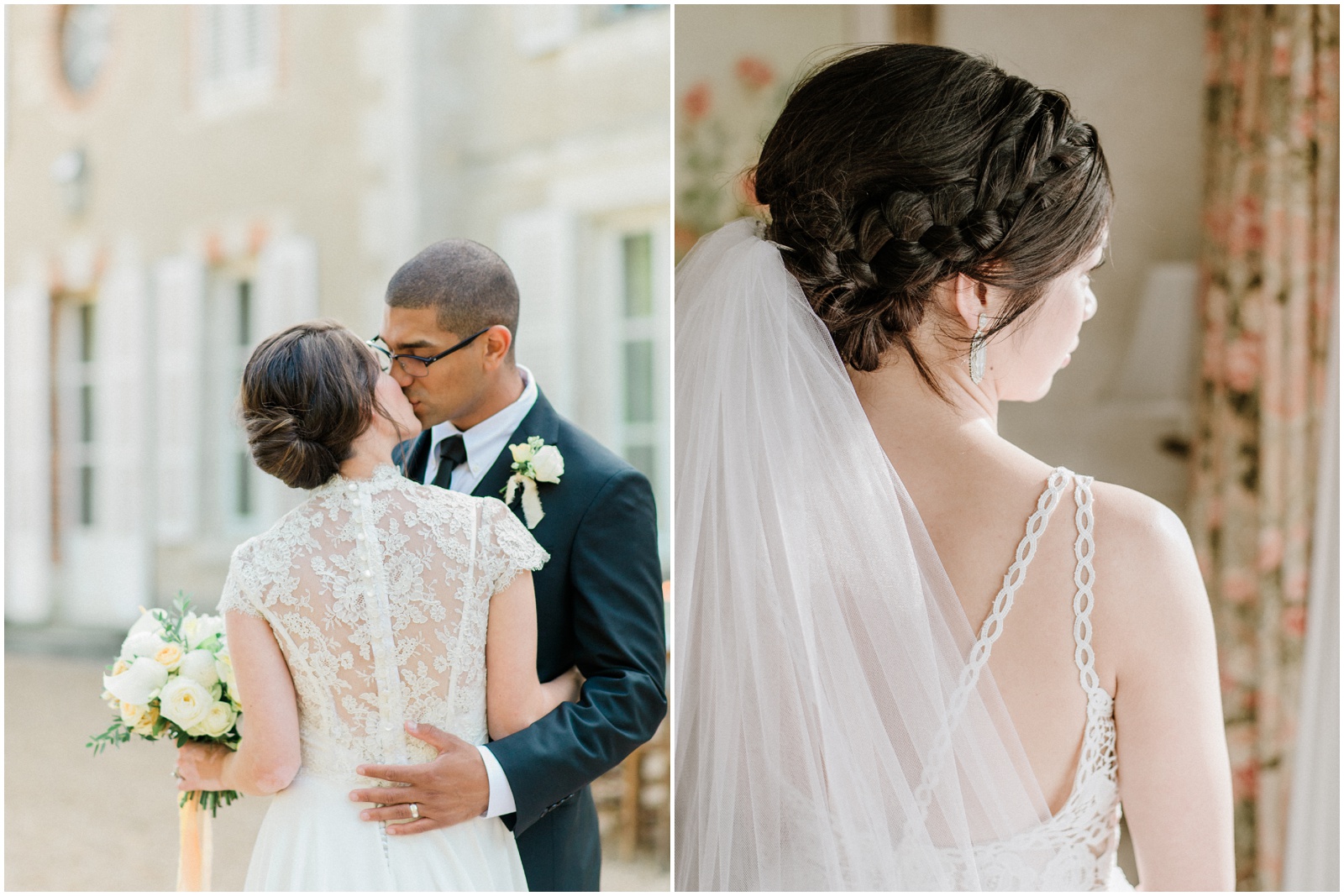
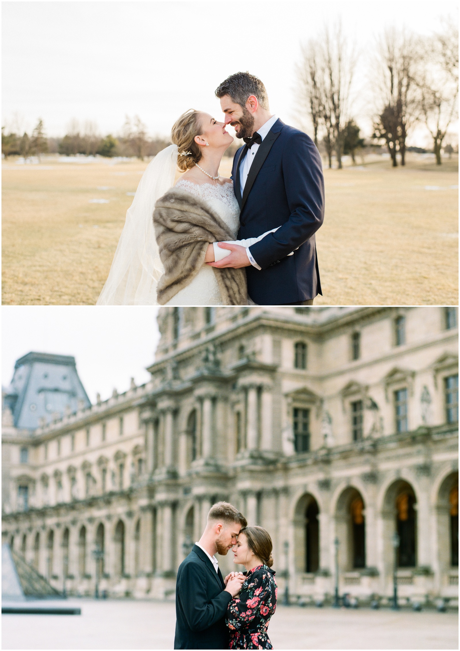
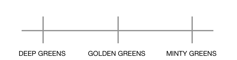
Posing is going to fall somewhere along the spectrum of Fully Posed (often advertised as “fine art” style, but not exclusively) to Fully Unposed (often advertised as documentary style). Photographers who fully pose you will likely direct everything from the hands you use and the curl of your fingers, to your smile. On the other hand, photographers who are fully documentary will be hands off and capture things as they happen with no intervention.
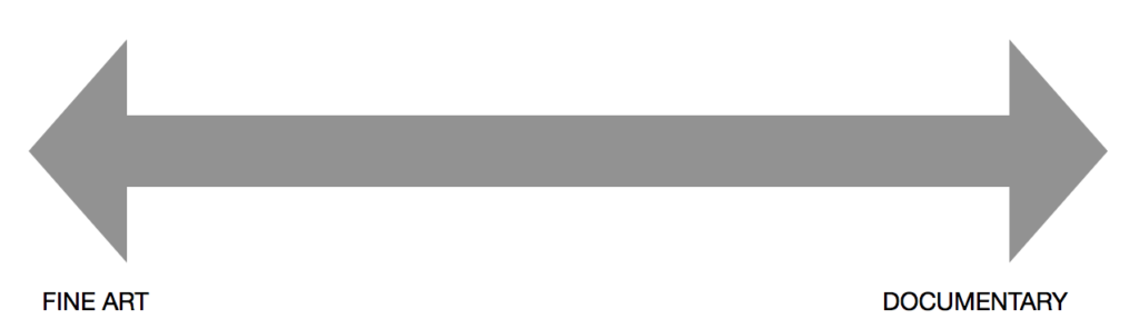
Examples: Jeremy Chou (fine art), Alan Law (documentary)
My approach falls somewhere in between the two. I will position you in the best possible light (for my style of editing) and in a flattering way that I believe you’ll love and then provide prompts that leave some room for interpretation. For me, that provides the best blend of candid expression and movement with elegant, flattering lines.
EDITING
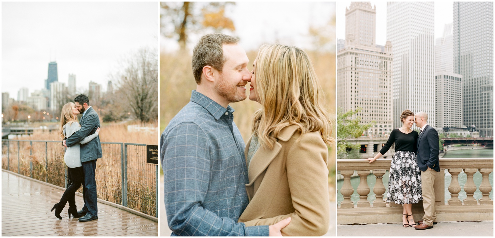
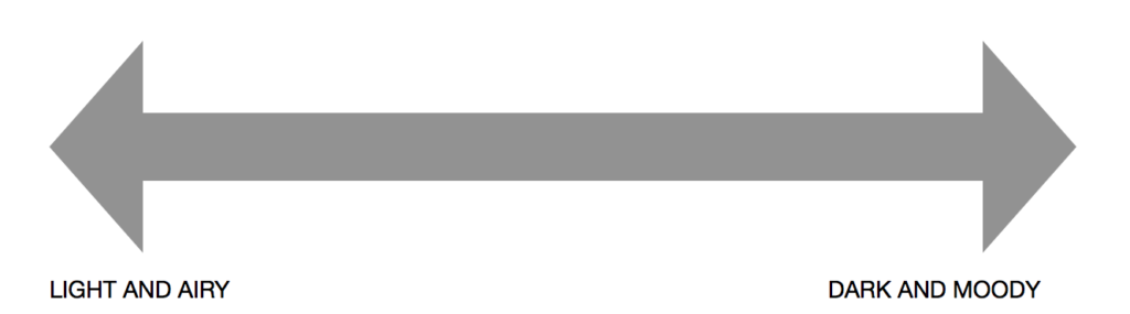
More or less, editing is going to fall somewhere along the spectrum of Light and Airy to Dark and Moody.
Both are exactly what they sound like. On the left-most end, Light and Airy is going to be whiter and brighter, with lots of highlights and fewer shadows. On the right side, Dark and Moody will have minimal highlights and will showcase deeper shadows, often having a more cinematic look to it.
Someone who is in the middle of the spectrum may be light and moody, for example, having the whites and highlights of the light and airy look but playing with the tones and shadows of the dark and moody style.
The fun part about this spectrum is that, more or less, no two photographers are on the same point in the scale!
Examples: Amy Demos (light & airy) & Anchor & Veil (dark & moody)
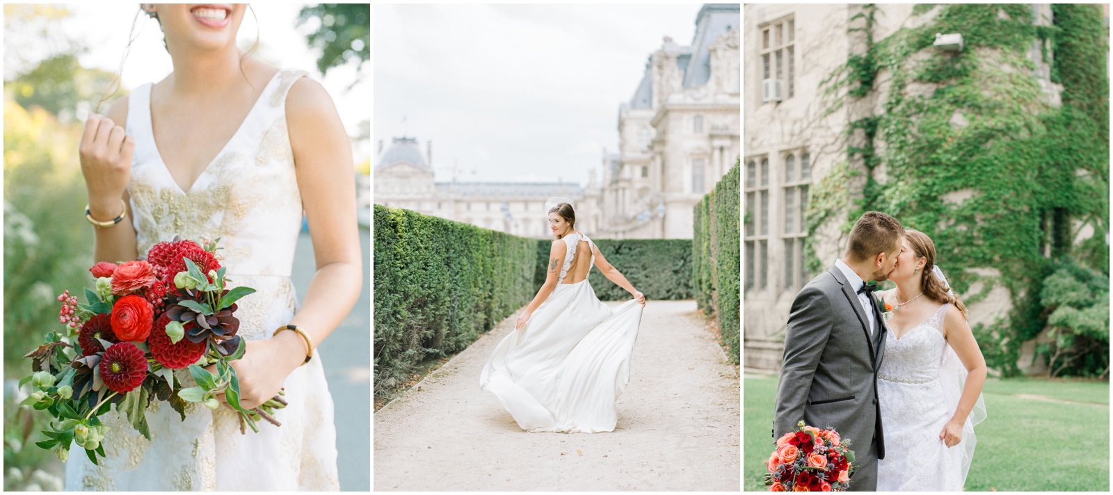
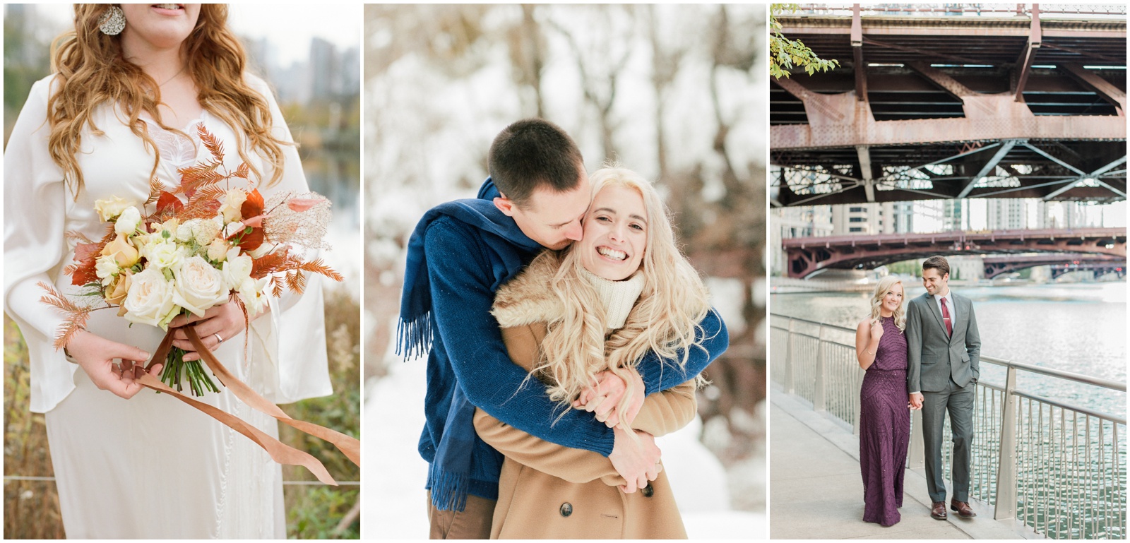
I personally fall on the light and airy side, but I’d say about halfway between the left most point and the center point. I like a little bit of shadow pop in my images and I keep my highlights pretty tame:
Within this editing spectrum are 3 sub-spectrums if you will. There are obviously thousands of variations that help make each photographer’s stye unique, but in my experience these 3 are ‘big ones’ that are not tied to any one side of the spectrum. I’d encourage you to look specifically at these components as you try to determine what you are drawn to stylistically in photos.
-
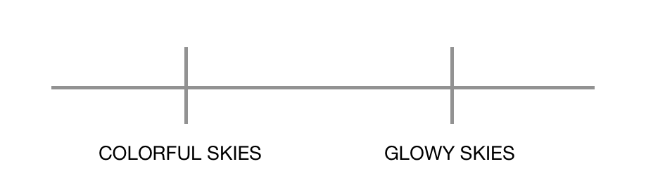
Greens
Every photographer is going to have a different opinion on the color green. Green is one of those colors that photographs differently in almost EVERY situation because of how the light is hitting it. Most photographers are going to have a specific tone of green that they aim for and that will influence a) their decisions on when/where they are taking photos and b) how they are processing those greens during editing. So when eying photos and looking at your photographer’s portfolio, consider the greens. Do you like your greens to be the pure primary color? Or do you like them to look more golden/yellow? Maybe you prefer them more light and minty? Or a deep forest green? Do you like them to be bolder and more saturated?
Examples: Kyle Szeto (deep greens), Hope Taylor (golden greens), Elizabeth Moore (minty greens)
Here’s the tones I typically aim for in my greens:
-
-
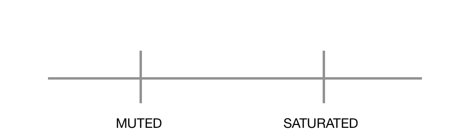
Skies
Ok this one is going to sound weird but, trust me, I see this come up all the time with photographers saying their clients are unhappy because they want the sky to be more colorful. The question I want you to evaluate here is, do you want colorful skies in your photos, or do you not really care either way? Because a variation that happens all over the editing spectrum is how photographers handle skies. If you look at my work, for example, you will hardly ever see a true blue sky. This has NOTHING to do with whether we as photographers are light and airy or dark and moody. It has to do with how and when we shoot outdoors and/or whether or not we use sky overlays in editing.
If you don’t care how your skies look, great, just focus on all the other components when picking your photographer. But if you DO want true blue skies or elaborate sunset colors, you need to pick photographers whose work shows that consistently. If you pick me, and then get your photos back and say ‘I want the sky to be more blue’, there’s not going to be much I can do to help you because so much of why my skies are not blue has to do with decisions I make when taking my photos, so I can’t just change it later. Decide NOW if you like that look and make sure you find someone who takes that approach!
Examples: Belinda Philleo (colorful), Mallory Dawn (glowy)
Here’s generally what you can expect from my skies:
-
-
Saturation
Saturation essentially refers to how intense the colors appear. Some photographers like a desaturated look, with more muted colors. Others like the bold, vibrant look of more saturated colors. Consider what you are drawn to. Do you like photos with bright, vibrant colors or do you prefer softer tones? Again, this variation can happen anywhere on the spectrum, so you may decide you want dark and moody with muted colors. Or you may decide you want light and airy with vibrant, saturated colors. And you’ll find photographers who match either of those!
Examples: Caroline Logan (muted), David Mendoza (saturated)
I fall a bit between the two. I wouldn’t say I’m bold and vibrant but I do love pops of color!
Ok I’ve given you a lot to start thinking about, so don’t hesitate to reach out if you have any questions! The ultimate goal is for this to help you identify the kind of photographer you most resonate with and save you from discovering too late that you like a different style. If you’re overwhelmed, be sure to come back for Part 2 where I’ll give you some practical steps for figuring this all out!
Happy Planning!
—
Other posts in this planning series:
Recommended Chicago Wedding Vendors
Choosing your Photographer: Number One Question to Ask
—
see more wedding planning resources here
-


[…] In the meantime, I highly recommend reading Nicole Jansma’s post she wrote all about photography styles here! […]